
Reimagining the railway booking journey
A research-led redesign of the Indian railway booking experience, exploring clearer navigation, journey continuity, and decision support across an evolving digital ecosystem
Platform
Mobile
Role
UI/UX Designer
Total
28 Screens
Project Type
Self-Initiated Project
Scope
Research · UX Strategy · IA · Interaction · UI · Testing

My Approach to the Redesign
4
3
2
1
Validation
Design Response
Structure
Research
01
Research
Understanding the existing experience and user friction
The existing journey was examined through user research and interface analysis to identify recurring friction, behavioural patterns and opportunities for improvement.
Understanding an Evolving Railway Experience
The project began with an audit of IRCTC Rail Connect, the railway booking app used by millions of passengers in India. As RailOne emerged as a unified platform for major railway services, I revisited the experience to understand what had improved, what friction remained, and where further opportunities existed.
Auditing the Earlier IRCTC Rail Connect Experience
The earlier experience distributed booking and supporting railway tasks across service-heavy screens, increasing scanning effort before users reached a focused journey.



Research Methodology
Core Research Insight
Comparative Review
Task Observation
Personal UX Audit
User Survey & Conversations
Gathered feedback from 19 participants on the earlier IRCTC experience, including booking friction, navigation, login, and payment concerns
Audited IRCTC Rail Connect first-hand, then later reviewed RailOne to examine hierarchy, service organisation, booking entry points, and journey continuity
Compared the earlier IRCTC structure, RailOne’s consolidated model, and the redesign across booking access, service organisation, and journey context
Observed how participants approached railway tasks in the earlier experience, including finding trains and locating common services
The entry screen gives equal visual weight to authentication, alternate IRCTC services and secondary links, diluting the clarity of the primary entry point.
Essential railway functions are grouped into a separate service layer, adding an extra navigation step before users can begin their intended journey.
Dense train information and availability controls make it difficult to compare options and identify the most suitable journey at a glance.
Critical passenger, insurance, payment and verification details are presented in a long, information-heavy screen, making the final step feel complex and error-prone.
The booking form exposes several journey parameters and conditional options simultaneously, but lacks a clear visual hierarchy between essential inputs and supporting preferences.
What users had to say about IRCTC
Research Findings
Research revealed recurring patterns across user interviews, observations, and survey responses. Users weren't asking for more features. They were asking for easier access to the features they already needed.
19
Participants
78.9%
Use the Mobile App
Top User Requests
BETTER BOOKING FLOW
63.2%
EASIER NAVIGATION
52.6%
IMPROVE PERFORMANCE
52.6%
IMPROVE VISUAL DESIGN
47.4%
Key Pain Points
Users face several friction points across the journey. These significantly impact their overall experience.
57.9%
Login and verification
Finding 01
42.1%
Navigation between screens
Finding 02
36.8%
Ticket booking flow
Finding 04
42.1%
Payment experience
Finding 03
Friction across the existing journey

Login
The login screen attempts to serve multiple purposes simultaneously.

Train Services
Railway services, travel services, and commercial offerings coexist within the same navigation space.

Train List
Users evaluate trains using multiple factors including timing, duration, class availability, and quota information.

Confirmation
The system prioritizes data collection efficiency over progressive disclosure.

Home
The home screen presents numerous railway-related actions at the same visual priority level.

Booking
Users only reach this focused experience after navigating through multiple service-heavy screens.

Passenger Details
Booking details, passenger information, preferences, GST options, and payment choices are combined into a single continuous experience. Users encounter multiple categories of information before payment.

Payment
The final step still contains competing elements instead of focusing entirely on successful payment completion.
Research Insights
Competing priorities increase scanning effort
The interface presents primary booking actions alongside secondary services at similar levels of visual priority.
Impact:
Users spend more time scanning the interface before deciding where to begin.
Related services lack predictable grouping
Related railway tasks are distributed across different sections and service layers rather than organised around clear user intent.
Impact:
Users must remember where specific functions are located or repeatedly scan service-heavy screens.
Common tasks are difficult to locate quickly
Frequently used services exist within the platform but often require users to navigate through multiple sections before reaching them.
Impact:
Additional navigation increases effort and slows task completion.

Key Insight
Users struggled with complex flows, payment friction, and cluttered navigation.
Pain points in RailOne Experience
RailOne Screens
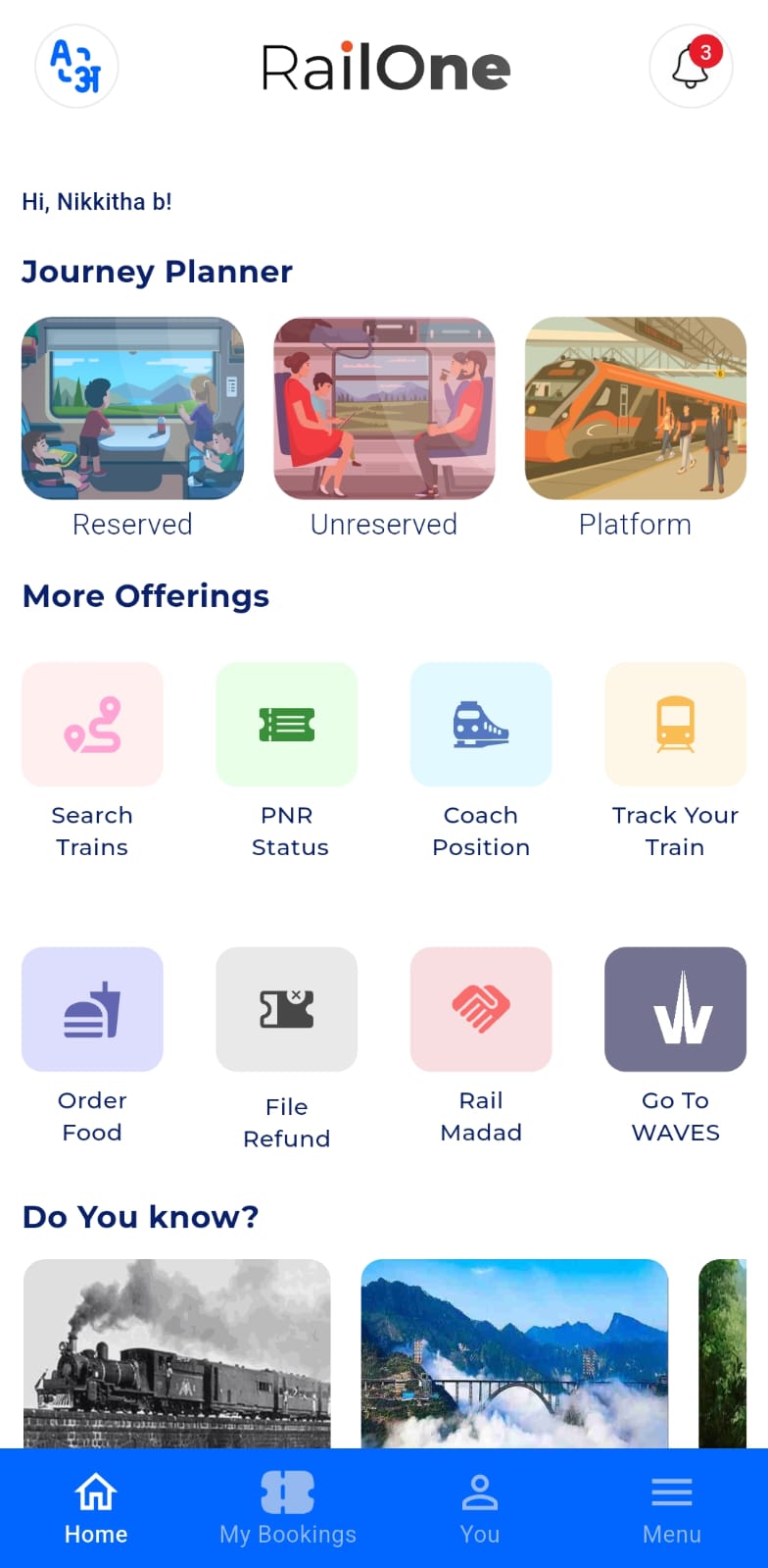
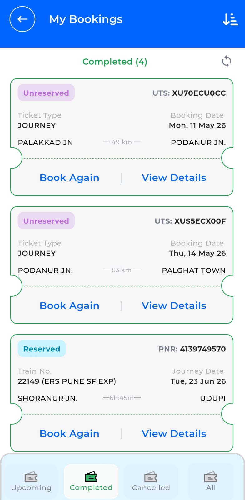
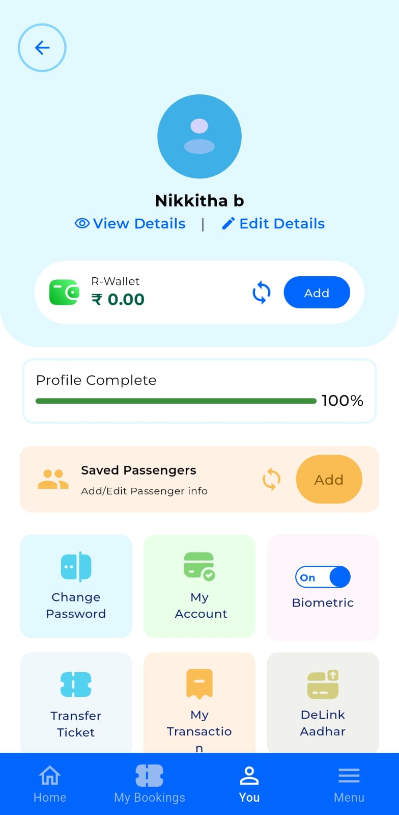
RailOne brings multiple railway services together in a single platform. It materially improves the ecosystem by bringing reserved, unreserved, and platform ticketing into one application. It also introduces stronger continuity through unified bookings, saved passengers, wallet access, and biometric login.
Home
My Bookings
You

Menu
Key Pain Points
BETTER BOOKING FLOW
While core ticketing options are visible, the screen behaves more like a menu than a journey workspace.
LIMITED DECISION SUPPORT
Train comparison lacks contextual insights like better availability on nearby dates or fare guidance.
BETTER BOOKING FLOW
Bookings, profile, wallet and settings are spread across 'my Bookings', 'You' and 'menu', increasing navigation effort.
SEARCH FLOW OPENS IN A NEW SCREEN
Users must leave home to configure their journey, adding an extra layer before starting the core task.
HIGH VISUAL WEIGHT ON SECONDARY CONTENT
Promotional and informational content competes with task priority, especially for the First-time or infrequent users.
JOURNEY CONTROL CONTEXT IS NOT CENTRAL
Upcoming journeys, live status and travel updates are not surfaced on the primary home experience.
Key Insight
My audit found that consolidation solved only part of the experience. The Home screen still behaves primarily as a service launcher, core journey planning opens into separate task flows, and active journey context is not central to the primary experience. Profile, bookings, and secondary controls are also distributed across My Bookings, You, and Menu.
RailOne was reviewed separately through a personal UX audit after the original IRCTC research. These observations informed comparative reflection but were not part of the 19-participant study.
02
Structure
Turning insights into a clearer experience framework
Research findings were translated into prioritised flows, clearer information hierarchy and logical service groupings, defining the foundation for the redesigned experience.
Experience Principles
Booking Before Browsing
Group by User Intent
Make Key Information Easy to Scan
Keep the Experience Predictable
Current Direction
Feature Rich
Complex Navigation
High Cognitive Load
Slow Decision Making
Design Direction
Clear Hierarchy
Focused Navigation
Guided Decisions
Faster Booking Experience
Strategic Design Goals
Reduce Booking Friction
Make booking faster, easier, and more focused
Improve Discoverability
Help users find the right features at the right time
Simplify Navigation
Create a clear and intuitive experience
Restructure Information Architecture
Organise information for clarity and easier access
Explore conceptual AI-assisted decision support
Use AI to support decisions at moments of uncertainty
Product Ecosystem
Home
Booking Flow
Ask AI
IRCTC
My Trips
Services
Account
Information Architecture
Splash Screen
Onboarding
Sign-in / Sign-up
Home
Journey Search
Reserved Journey
One Way
Round Trip
Unreserved Journey
Platform
Quick Actions
PNR Status
Track Train
Tatkal
Food in Train
Station Map
Ask AI
Upcoming Journey
Live Updates
Recent Searches
My Trips
Upcoming
View Ticket
Live Status
Order Food
Cancel Ticket
Completed
View Ticket
Book Again
Completed
Refund Status
TDR History
Services
Train Information
PNR Status
Chart Vacancy
Station Map
Track Train
Divyaang
Train Schedule
IRCTC E-Wallet
Tatkal
File TDR
Cancel Ticket
Ask AI
Journey Add-on
Food in Train
Hotel Booking
Tourism Packages
Other Transport
Flight
Bus
Metro
Tourism
Shopping & Offers
Yatri Mall
Daily Deals
Gift Cards
Account
My Profile
Authenticate User
Payment Methods
Notifications
AI Assistant
Logout
History
My Bookings
Cancelled Ticket
Food Order
Failed Transactions
Refund History
TDR History
More
Contact Us
Booking Flow
The redesigned booking journey prioritizes task completion by reducing decision points and progressively revealing information only when required.

03
Design Response
Translating research and audit findings into interface structure
Research insights and the proposed structure were translated into interface flows, interaction patterns and a cohesive visual system, shaping the redesign into a testable experience.
Redesigned Screens

Train List

Reserved Booking Confirmation

Services

Upcoming Trips

Completed Trips

Cancelled Trips
HomeScreen
Reserved Round Trip

Platform Ticket

Login Screens

Through Password

Through Fingerprint

Through Mobile

UI Foundations
Colors
Primary
#2A74C9
Primary Surface
#FFFFFF
Muted Surface
#F7F7F7
App Background
#F2F6FF
Emphasis Surface
#E6EEFF
Stroke
#C8D4EB
Availability
#08633C
Alert / Warning
#FF9B29
Caution / Error
#A30000
Typography
Noto Sans
Noto Sans
20 px
Noto Sans
16 px
Noto Sans
14 px
Noto Sans
13 px
Noto Sans
12 px
Noto Sans
11 px
Primary Text
#000000
Secondary Text
#555555
Hidden / Muted
#AAA9A9
Iconography

Google Icons

Selected

Muted / Hidden


Booking in Motion
Seat Availability Reveal
04
Validation
Testing the redesigned experience through realistic railway tasks
The redesigned prototype was evaluated through realistic tasks to identify hesitation, backtracking and support needs before drawing final conclusions.
How I Evaluated the Redesign
Test Setup

Method
Remote moderated testing

Participants
5 Participants from my network

Platform
Interactive prototype via Google Meet

Duration
10-15 min per session
Observed Usability Evidence
What I observed during the Test
01
Easier to Start
05/05 participants started the booking journey from the primary entry point on the home screen without confusion
02
Services were easier to find
Participants located PNR Status, Food Ordering, and Platform Ticket without opening unrelated sections.
03
Smoother Flow
Participants moved through the booking flow without returning to earlier sections to recover from navigation errors.
04
Moving through booking
The confirmation state was recognised as the completion of the booking journey.
One interaction needed a clearer cue
Observed
2 of 5 participants did not initially understand that a second tap on the selected class would show more details.

What this revealed
The selected state made the active class clear, but the second tap was easy to miss.

Refined
Added a visible prompt below the class options to make the next action explicit.

What the Redesign brings together
IRCTC

Multiple layers before core booking
Scattered services across sections
High visual noise and competing actions
Limited context for ongoing journeys
RailOne
Home acts manly as a service launcher
Journey context not central on home
Search flow opens in a new screen
Actions distributed across My Bookings, You and Menu
Redesigned Experience
Direct booking access on home
Upcoming journey and live updates visible
Services grouped by intent
Contextual guidance for better decisions
Structural Change
Redesigned Experience
5
Core Stages
A simplified, focused journey from search to confirmation
Search
Select
Passenger
Pay
Confirm
Key Insight
Within the five moderated sessions, participants entered the primary booking flow without confusion, located the tested services without opening unrelated sections, and completed the prototype journey without navigation recovery.
The sessions also exposed one interaction ambiguity in the class-selection pattern, which was refined with a clearer action cue
Study Limitations
The study involved five participants from my personal network, so findings are directional rather than representative of the wider railway user base. User research focused on the earlier IRCTC experience. RailOne was reviewed later through a personal UX audit and comparative analysis, without dedicated user interviews or usability testing.
Prototype validation did not evaluate backend systems, live booking conditions, payment processing, accessibility compliance, or production-scale performance.
One journey ends here.
The next could start with a conversation
I’m Nikkitha, a UI/UX designer driven by curiosity, creativity, and the belief that design is everywhere, often hiding in the things we overlook.
START A CONVERSATION
